

Welcome to the release of the fifth block for the Fall Into a QAL.

This QAL is brought to you by Partners in Design: Where Friends and Fabric Meet.

Presenting the Acorn Block

This block is 12.5″ unfinished.
This block is designed by Kathleen McCormick of Kathleen McMusing. Because she aims to please, she designed two very different blocks. You can choose this pieced one or a split applique which is found on her website. Click here to download either of these free patterns. Remember they are free only as long as the Fall Into a QAL is in process. Don’t delay, download your pattern today.
Making This Block Just a Little Easier
It was a tough decision but I chose to make the pieced block. You’ll want to visit all the hosts to view their takes on this pattern or on the appliqued one before you decide which one to make.
This pieced acorn block is very easy to do. I’ve enjoyed seeing your lovely blocks on Facebook. I’ve read that some of you aren’t happy with the way they look and a few of you choose to redo them.
I’ve been quilting for many years and learned a lot by doing things the wrong way or wishing I’d have done something differently or used a different color or fabric.
I’m still learning. Sometimes it’s hard for me to decide just which fabric or color I should use. This week I’d like to share what I’ve learned so far and offer you my suggestions for choosing fabrics and colors for your blocks/quilts.
Tu-Na’s Tried and True Easy Guide to
Fabric and Color Selection for Quilt Blocks
“With colors you can set a mood, attract attention, or make a statement.” Tiger Color
Lesson 1. Let’s Take the Wheel for a Spin
Have you noticed how some people just seem to have a knack for picking colors that “play well” together? The rest of us need to refer to the color wheel to learn the art of choosing colors or jump to the end of this section to read my three easy hints to color selection.
Keep a color wheel handy
Color wheels can be made using this idea from Nancy’s Quilting or this idea using Kona solids from In Color Order. Free printable color wheels can be found online here and here or can be purchased in stores. I’d suggest having two: one to keep in your purse to refer to when shopping for fabrics and the other to keep in your sewing room when you shop your stash while picking fabrics for your individual blocks or entire quilts. Your fabrics may not match exactly to the colors on a wheel so think of the wheel as a guide.
Let’s begin with the basics
The color wheel is divided into:
Primary Colors (red, yellow, blue)
which cannot be made by combining any other colors;

Secondary colors
which are made by combining two primary colors resulting in orange, purple, and green;

Orange is made by mixing red and yellow. Green is made by mixing blue and yellow. Purple is made by mixing red and blue.
Tertiary colors
which are made by combining a primary and a secondary color.

Mixing blue and green produces a blue-green color which is often called teal. Mixing red and purple produces a vivid red-purple color called fuchsia.
So how does this information relate to quilting?
Knowing where a specific color is in respect to the other colors on the color wheel will help you select those color combinations that look pleasing or good together. Tiger Color’s article here is worthy of reading.
Just how does one use the color wheel? There are several ways to select a color scheme to make your block/quilt look great.

You will find many ways to choose colors that look great together. You’ll find the examples above for making color schemes such as primary, secondary, intermediate (tertiary), analogous (harmonizing), complementary, and split complementary. I also learned tetradic (rectangular), and squared.
Here’s a few ways that I’ve created color schemes using the wheel:
Monochromatic: Choosing one color/hue to create an entire block/quilt is possible. Interest is built by using different shades, tones, and tints of that one color. Pictured below are some examples of blocks that I’ve recently made that are monochromatic.


Complementary: Colors that are straight across from each other on the color wheel look great together such as these red gnomes and green trees and the blue-green (teal) and red-orange star pictured below. Complementary colors are also referred to as opposites.


Here’s an example of a fabric pull for a complementary color scheme. Isn’t it pretty!
Split Complementary: This one is often suggested for beginner quilters as it’s easier to create and more forgiving. To locate the split complementary color scheme, choose one color. Now locate the color exactly opposite or straight across the wheel and notice the colors on each side of this one. Those two colors plus your starting color would make the split complementary color scheme. Here’s some examples of how it looks on the color wheel and with fabrics.


Would you use any of these colors in one block/quilt?
Analogous: These are colors right next to each other on the color wheel. They can also be called harmonizing. I’ve pictured three examples below.

The one on the left shows that one fabric can contain one or more of the desired colors.
Triadic: These are three colors that are separated equally from each other around the wheel. They also form a triangle if you draw the lines from one to the other. Let’s take orange for example. Jumping over three colors around the wheel would give us green and then jumping over three more colors would give us purple. Those three colors: orange, green, and purple, would look great together in a block. Here’s some examples.


All of these look great but they push a lot of people out of their comfort zone.
Try making some blocks or a whole quilt in a color scheme that you wouldn’t normally choose. If you’re needing more examples, see this article on The Spruce Crafts on how to use the color wheel to build color schemes.
Learning to read a fabric’s main color
Solid colors are easy to read or tell which color/hue they belong. But how does one figure out the main color of a fabric when there are many colors involved?
- Look at the background. If you see a lot of the background, choose that as the main color. However, if the design is large and overpowers the background, look for the largest part of the design that tends to take over or a color that is used the most in the design and use that as the main color. Yellows (and sometimes red) tend to dominate, are easily seen and can easily take over a fabric’s color palette.
- Hang up the fabric and step back. Note what the first color or part of the fabric draws your attention. Would that be the main color or the accent? Squint your eyes. Set that fabric on a piece of white or black to remove surrounding color distractions.
- Sometimes, you may decide a particular fabric is one color but when placed beside another fabric it suddenly looks different. That happens. Then you get to decide how you want to classify it.
- Ask someone else but remember that we all perceive colors differently. Men see colors entirely differently from women and are often good at putting colors together (except for their own wardrobe).
 I read the fabric on the left to be either a red or red-purple depending on what was placed next to it. The next fabric is definitely a yellow-orange. Even though the next fabric contains blues and purples and even pink, I read it as green. Finally the Kaffe Fassett coneflower reads as red.
Did you know?
White is what you see when you subtract all color. You cannot mix any combination of colors from the color wheel to create white. Therefore, when talking about pigments, white is not a color.
Black is a color and is created when you take all three primary colors and mix them together.
Gray is created when you mix two complementary colors together. Modern quilters are using gray more often in their quilts.

This is not a black and white picture. I made a block of only scrappy grays. Here’s what Irene wrote about her request, “I have been collecting “true” grey for a few years and I have learned that grey is not always grey….but if it has to be “tinted” in one way or another, I’d prefer blue based grey.” Have you noticed how some grays can look bluish, brownish or even greenish? Some browns can have a pinkish cast.
White, black, and gray always create contrast in your blocks and are considered neutrals. To make it even more confusing, all colors have a “neutral” when black, white, or gray are added to a hue. These are referred to as “earth tones” such as clay, or olive green. Neutrals will work with any color, though some better than others.
“So where does that leave tan and beige?” I asked my daughter who is an interior designer. She responded, “Tan and beige are also considered neutrals. They usually fall within the yellow/orange realm of the color wheel, depending on the tint. That’s why you get some beige’s that seem to have a pink, blue, purple, green, etc. tint to them.”
The issue of brown is a bit murky. Some say that brown isn’t on the color wheel; others say that brown is a shade of orange; while still others insist that brown is made by mixing the three primary colors and belongs in the center of the color wheel. According to my daughter, brown is actually created by taking a primary color and mixing it with its complementary color. Yah, I know, clear as mud. Let me know if you’ve figured out brown’s relationship to the other colors. All I know is that I like the combination of brown and blue and I especially like the look, and taste, of dark chocolate and milk chocolate!
Now you know!
Uffda! Will this section ever end?
Oh, there’s so much more that I can say about color! We’ve hardly talked about color values which are the lightness (tints) and darkness (shades) of colors or saturation which is how intense a color is. How boring this world would be if we only had those 12 hues (that’s what an individual color is called) found on the color wheel.

This is the best free example I could find of a color wheel showing different shades and tints of a color. A tint is taking a hue and adding white to lighten the hue; a shade is taking a hue and adding black to darken the hue.
Generally, we want to choose fabrics for our block/quilt that have the same color value. For example, we might choose all bright colors for a toddler’s quilt and all pastels for a baby quilt. However, using fabrics that are tints or shades of your chosen color adds interest. If you want something on your block or quilt to stand out or something to play a less dominant role, try using a different shade or tint of your selected color. When we are too careful with matching colors, our block/quilt can become uninteresting or boring.
Hint: A good way to test this is to squint your eyes at your fabric selection. If it all blends together the colors are too similar. If you still see separate colors then you have the perfect combination.
Hint: You can also take a picture of your fabric choices and view that picture in black and white. This will tell you if you have fabrics that read the same value and which ones stand out. Doing this will help you decide which particular fabrics you want to use in your quilt to create the look you want.
If you’re still shaking your head and wondering what’s the value in color, see Quiltsocial’s article here.
Creating a mood
You’ve heard of warm colors (red, orange, and yellow) which make you feel energetic and cool colors (blue, purple, and green) which make you feel calm. Use a cool color if you want something in your block to recede or fade away. Use a warm color if you want something to come forward.
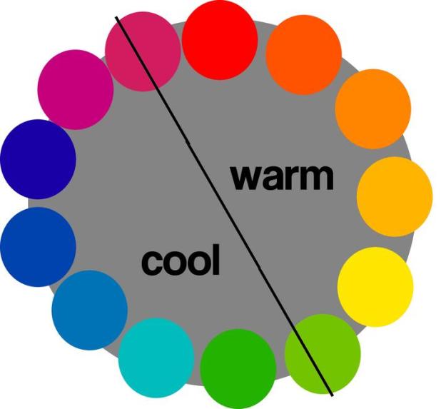
The colors that the line is intersecting can be either cool or warm.
If you’re building a block or quilt with cool colors, add a warm color to give it some pizzazz. Conversely, using all warm colors are great but try adding a cool color for added interest.
Still want more info?
- Search the internet and other blogs for more info on color and choosing color combinations. Jeni at In Color Order discusses color on her posts here. She wrote a whole series of interesting posts on color that you can check out here.
- Invest in several good books on color theory. Vanessa Christensen, who authored a series of books devoted to a specific color (Simply Color Red, Simply Color Blue, Simply Color Yellow, Simply Color Purple, Simply Color Orange, Simply Color Green), which discusses color theory in more depth. Jean Wolfrom’s book on Color Play as well as Quilt Color Workshop by Brioni Greensberg, Lynne Goldsworthy, Tacha Bruecher and John Adams are also good reference books.
- Take a class. Craftsy offers a free class on Color Theory. It’s worth a look here.
It’s handy to know how colors work in combination and what colors look great together but don’t let it consume you. Pick what you like. Look to nature and nature’s colors (a sunset, ocean, or field of flowers) for color inspiration. Keep on trying to create new color schemes. The more blocks and quilts you make the more practice you get at creating interesting ones.
Tu-Na’s Three Easy Hints to Selecting Colors for a Block/Quilt
About now you may just want to throw your hands up in the air and walk away from your sewing machine forever. But before you do, I have three easy methods for those of us who are feeling bogged down with too much color theory.
- Choose a good focus fabric. Find one that you really like that has several different colors. Now choose other fabrics for the block/quilt that are the same color/hue as those found in that focus fabric. The manufacturer has done all the work for you! Isn’t that nice?
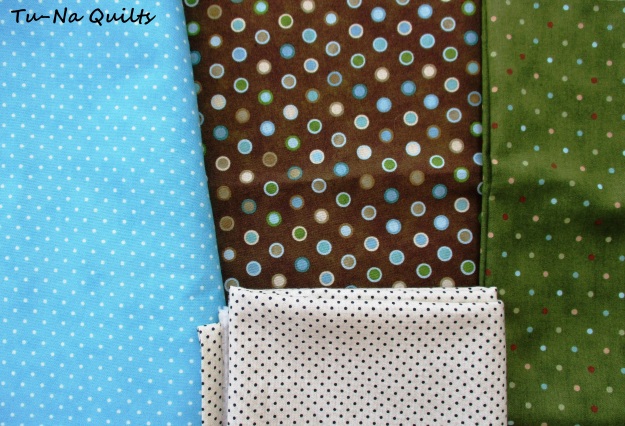
I chose the dots with the brown background as my focus fabric for my acorn block. The blue dotted fabric, which I am using for the backgrounds in my quilt, was originally chosen because it matches the blue dots in the focus fabric. Looking through my stash, I found a fabric with dots having a green background which was very close to the same shade as those green dots in the focus fabric. I didn’t notice that the dots in the green fabric are also the same colors as the focus fabric. That was a happy accident.
- Look at the selvedge edge. Most manufacturers have placed color dots in the selvedge edge. These dots are all the colors that are used in that fabric. Use these dots found on your focus fabric to help you choose fabrics in those colors or shades of those colors to add to your block/quilt.

When I use the dots on the selvedge of my focus fabric, I find my supporting fabric by looking for the color that is used the most in the fabric. In this example, there are 12 different shades, tones, and tints of purple, so I would use more purple but include some green for contrast and some yellow/orange to provide accent.
- Buy a pre-selected bundle. Beginner quilters will find this option to be less overwhelming but do take a moment to analyze how the designer arrived at the colors that were included. One option to using a pre-selected bundle is to use your color wheel to add in a few other fabrics not included to round out the selection already prepared for you. Doing so will help you feel like you “own” your quilt as it will reflect your personal interests and preferences. As you become more advanced in your quilting, you’ll find picking out your own colors and fabrics to be very rewarding.


I recently won this bundle from Benartex and opened it to reveal the beautiful colors just for you. When shopping for a bundle it’s often hard to tell what all the colors are inside. Ask a clerk if they have any of the fabric in bolts so you can see them better or find pictures of them online.
And Then There Was More
Choosing eye-pleasing color combinations isn’t the only factor necessary to create great blocks or quilts. Next time, I’ll continue discussing Tu-Na’s Tried and True Easy Guide to Fabric and Color Selection for Quilt Blocks with Lesson 2. Variety is the Spice of Life which is a discussion on how I carefully select fabrics that provide visual interest that keep blocks/quilts from becoming boring or overwhelming. In the meantime, I’ll enjoy seeing pictures of your acorn block on our Facebook page!
Join this QAL
You can join in anytime. Each 12.5″ (unfinished) block will be released every other Tuesday with the last one scheduled for release on October 16th. You are free to make these blocks any way you want. However, if you are wanting to enter the contest, be sure to read the rules found in the Enter to Win section below to make sure your entry counts.
The patterns will remain free on the respective designer’s blog until November 13, 2018. Designers may choose to keep them free after that time or make them available for a charge in their pattern shops. The final finished top containing all 12 of these blocks (it doesn’t have to be quilted) link up for the mega giveaway is November 13th at 11:59 EST.
Enter to Win
A winner will be selected at random from all the blocks posted. Details are listed below.

ENTER FOR A CHANCE TO WIN THESE
FOR MAKING AN ACORN BLOCK
Two printed “Vintage Blessings” exclusive mini patterns from Shabby Fabrics.
Vintage Kite Table Runner Garden Wall Hanging (pattern details here)
Vintage-Garden-Wall-Hanging (pattern details here)
(Click this link to request the latest catalog of Shabby Fabrics.)
AND A
5” charm pack of “From the Chateau” by Lisa Audit for Wilmington donated by Kathleen Scargle McCormick of Kathleen McMusing.
Thank you, Kathleen!
Entering to win the prizes above is as easy as 1, 2, 3.
- Everyone (You must be 18 to be able to enter to win prizes) gets to participate because International entries are welcome! You do NOT need to have a blog to enter. Hosts and designers are not eligible to win.
- Make a block using one of Kathleen’s patterns. Take a picture of it. Slight variations of the pattern are ok such as embellishments but keep your block true to the designed pattern if you are entering the giveaway. The block should definitely be recognizable as one made from this free pattern. Deviating too much (or substituting a different block entirely) will cause your entry not to be counted. If you have questions if it’s allowed for entry into the giveaway, please ask me before you cut.
- Post a picture of your block before 11:59 PM EST, July 23rd either on the linky party found on Kathleen’s post here, on the Facebook page, or on Instagram #fallintoaqal.
Winners are drawn from the eligible pictured blocks and prizes awarded every other week. A mega grand-prize using all 12 of the block patterns sewn into a quilt top/flimsy (quilting not necessary) will be awarded at the end of the Fall Into a QAL .
See These Hosts for Inspiration and Tips
on Making the Acorn Blocks
Block Designer — Kathleen McCormick of Kathleen McMusing. Please visit her blog to download your free patterns.
- April at JANDA Bend Quilts
- Vanda at Quilting with Vanda
- Sherry at Powered by Quilting
- Bobbi at Snowy Days Quilting
- Jennifer at The Inquiring Quilter
- Abbie at Sparkle On
- Karen at Tu-Na Quilts, Travels, and Eats Thanks for stopping by. I hope you’ve enjoyed seeing my Acorn block brought to you in living color.
Thank You to Our Sponsors
These are our prize sponsors throughout the QA. The sponsor for each bi-weekly prize varies. The Final Grand prize bundle and sponsors will be announced 10/16/18.

In addition, the following members of Partners in Design are providing prizes as well:
- Abbie at Sparkle On
- April at JANDA Bend Quilts
- Kathleen at Kathleen McMusing
- Sandra at Sandra Healy Designs
- Sherry at Powered by Quilting
- Vanda at Quilting with Vanda
Come on Back for the Next Block Release
Join me on July 24th at 12:00am EDT for the release of the sixth block designed by Sherry Shish of Powered by Quilting. It’s sure to be a beauty.
Don’t Miss Out on My Previous Fall into a QAL Posts
Tu-Na Quilts: Big Announcement!!! (QAL introductory post with a schedule of when the blocks are released and a sneak peek at the fabrics that I’ll be using.) Yes, I’m seeing spots!
Tu-Na Quilts: Block One—Hedgehog
Tu-Na Quilts: Block Two —Harvest Basket
Tu-Na Quilts: Block Three — Bonfire
Tu-Na Quilts: Block Four — Sunflower with Tu-Na’s Tried and True Easy Steps to Making Accurately Pieced Blocks

What I Learned Today:
- Life is full of choices; choose wisely. That’s a phrase I repeatedly told my kids as they were growing up. Because Kathleen offered two patterns, I had to choose which one to do. I easily could have done the other one and might still sew one.
- I have American roots. The spelling of gray is used more often in the U.S.A. and grey is used more often in other English-speaking countries. I’ve always written it as gray because grey just didn’t look right to me except when it’s served as Earl Grey tea.
- My daughter really knows her colors. Thank you, Emily, for trying to help me understand the wheel and editing my color lesson. I learned a lot but I still have much to learn!
- Isaac Newton invented the first color wheel in 1666.
- Most color wheels have 12 colors but some have 24. O.K. I really didn’t want to learn that!
- Researching can be fun. Click on this link to find the fun visual trick on finding a color’s complement without using the color wheel.
Question: What inspires your color decisions and color schemes? A good friend once said “My mum told me that blue and green should not be seen except in the bowl of a washing machine.” I giggle when I think of that saying but I sure do like the look of them together. I’ve even worn green and teal. As you can tell, I do like blue and green as I’m using them together in the backgrounds for this quilt. Oh, I still struggle with selecting colors at times but I’m hopeful, after researching for this lesson, that it will be just a little easier and a lot more fun.
Thanks for stopping by and do come again. If you want to be notified when my next post publishes, please consider subscribing using one of the three methods available on my sidebar: email, WordPress, or Bloglovin. I’d love to have you be part of my reading family.
Karen, Tu-Na Quilts
At this time I am not affiliated with any company, services, or products that I mention here on my blog. I just happen to like them.
Linking to:
Acorn block linky at Kathleen McMusing
Linky Tuesday at Freemotion by the River
Let’s Bee Social at Sew Fresh Quilts
Midweek Makers at Quilt Fabrication
Wednesday Wait Loss at The Inquiring Quilter
WIPs at Silly Mama Quilts
BOMs at Katie Mae Quilts
Finished or Not Friday at Busy Hands Quilts
Can I Get a Whoop Whoop? at Confessions of a Fabric Addict
Main Crush Monday at Cooking Up Quilts
Monday Making at Love Laugh Quilt
Moving It Forward at Em’s Scrapbag

I enjoyed reading your post, and I did know quite a bit of it. Nevertheless, when I go to the store to pick fabrics, I put different ones together and choose what appeals to me, no science involved. LOL
LikeLike
Pingback: Fall Into a QAL Block 5 Release! | Sparkle On!
You have a lot of good information here. And your block is really nice. You must have an awful lot of dotty fabrics! Not only the many colors, but the variety of scale is wonderful. I chuckled when I read your comment about men choosing their wardrobes. So true! Thanks for doing all that research for us. I enjoyed the visual trick for choosing complimentary colors.
LikeLike
Loved the color theory lesson – I’ll definitely be referring back to your post! Your QAL blocks are lovely!
LikeLike
Karen, I enjoyed that color wheel review. It was more than a spin–I’d say it was a road trip across the country of color! My favorite way to do color combos is go to Design Seeds, choose a photo I like there and match the color key to my fabrics. Great dottiness going on in your block!
LikeLike
Thanks for all the information, Karen! You’ve really been working hard the last couple of weeks to give people the tools to succeed. 🙂
LikeLike
Hi Karen, your Acorn is so cute! I love the blues and greens and dots in your blocks so far. Yours will be a pretty quilt!
Your color wheel and compatible fabrics information is awesome! I’m amazed by your knowledge on the subject. I often pick colors in my mind that go together, then they really don’t when purchased and sewn together. I’ve been meaning to order a color wheel and now it is a priority!
LikeLike
Thank you for sharing this great lesson about colors! It’s always hard for me to pick the right fabrics together, even with the color wheel ;)) I think your post will help me now. Cute acorn block by the way!
LikeLike
Love your dotted blocks! The color theory review is always helpful. Thanks for sharing on Wednesday Wait Loss!
LikeLike
Great tutorial on color Karen! I’m in the ‘what looks good together camp’, with help from the Ultimate 3-in-1 Color Tool. Wonderful tool to help identify the color family of some of my stash fabric. And I’m also one that believes brown is in the orange family!
LikeLike
I had to read this post several times as you have lots of wonderful information about color! Wow, I am so impressed about how to chose fabric that makes our sewing projects complete….your daughter, Emily is a great source if color desin.
LikeLike
Wow, lots of really good stuff in this post! No wonder they call it color theory!
LikeLike
Your color theory recap is fabulous! I also love your dots 😀 hehe.
LikeLike
Pingback: Fall Into A QAL Block 5! – Powered by Quilting
Pingback: Tu-Na Quilts: Fall Into a QAL Block Six Released Today | Tu-Na Quilts, Travels, and Eats
Pingback: Tu-Na Quilts: Fall Into a QAL Block Seven Released Today | Tu-Na Quilts, Travels, and Eats
Pingback: Tu-Na Quilts: Fall Into a QAL Block Eight Released Today | Tu-Na Quilts, Travels, and Eats
Pingback: Tu-Na Quilts: A Postage Stamp Turkey | Tu-Na Quilts, Travels, and Eats
Pingback: Tu-Na Quilts: Fall Into a QAL Block 11 Released Today | Tu-Na Quilts, Travels, and Eats
Pingback: Tu-Na Quilts: Fall into a QAL Block 12 Released Today | Tu-Na Quilts, Travels, and Eats
Pingback: Tu-Na Quilts: Fall Into a QAL Setting Idea | Tu-Na Quilts, Travels, and Eats
Pingback: Tu-Na Quilts: Fall Into a QAL Block 10 – Patchwork Pickles | Tu-Na Quilts, Travels, and Eats
Pingback: Tu-Na Quilts: The Best of 2018 | Tu-Na Quilts, Travels, and Eats